Today a speaker called Chris Redshaw from the 'Revolver Revolver' Design agency, came into college to talk to us about future possibilities for creative students. The revolver revolver design agency work with their clients to produce outcomes for branding, graphic design, wed design and advertising. He also came to explain why agencies are good for new and fresh designers.
The company started out in 2008 and is located locally within the Midlands. It is now 6 years old and they have been working to develop their portfolios and contacts over the years. They work to make the world a more visually appealing place to live, and from a business and creative perspective they believe that they can make a difference. They have worked with an array of clients over the last 4 years and have worked with many industries such as; social care, motor sport, property, marketing, photography, motion graphics, education, events and festivals, art and design, catering, law and professional services. They have produced work for the University of Derby, Derby Museum and Art Gallery, Quad, Repton School, Nestle - The Cocoa works and much more.
When talking about agencies he explained the positive outcomes of them and why we should consider them as aspiring designers, such as;
- Smaller Teams
When working within groups, smaller teams are often more successful due to easy access to communication, you don't have to worry about your ideas and thoughts getting lost. But also it allows you to have direct contact to the client rather than being the middleman, it creates an easier understanding of what the client wants to achieve creating a personal and direct alliance between clients and the business.
- Groups Vs. Individual
Often when working within a group you can work together and share ideas to create a better answer to a brief. Rather than having one opinion it allows you to develop your ideas to create a successful outcome.
- Specialized Attention
Similarly to the previous bullet point a smaller agency often allows you to focus upon a project for a longer amount of time giving you a chance to create the best work that you can. But it also means your not to stretched out of your depths meaning you can relate a better relationship with the clients meaning more successful contacts.
- Indisputable Work
There are no hidden sale initiatives as small design agencies like 'Revolver Revolver' thrive off getting contacts and producing high quality work for the clients. Allowing the business to gain a successful name for themselves with reasonable prices.
Since hearing the positive outcomes from what an individual can gain from working within a team it makes me as a student designer think more about what job aspect that I want to go into after going to uni. As I feel the importance of gaining relationships with clients to ensure that people believe in your work and the quality of it. But also to gain work experience within the industry to set you up in your future career.
Bibliography
http://www.revolverrevolver.co.uk/
Wednesday, 29 April 2015
Luke Waller
Luke Waller is an English Illustrator from Winchester. Since he graduated in 2008 from Bournemouth Arts University he has been working for 5 years within the industry. Over this time he has worked mainly across Europe for both large and small clients, within topics such as Editorial, Advertising and Publishing. He has also ventured into the world of fashion.

His most regular clients are The Financial Times and Highlife magazine (British Airways). However he has also managed to work for clients such as; Nike, Footlocker, RedBull UK, Samsung, Which?, Nividia, BBC History, Neptune Investment, Bloomsbury Publishing, Panorama Magazine (Italia), The Times Educational Supplement, Druglink, The British Medical Journal, Like The Wind Magazine, La Revue (France), Ammo Magazine, Popshots Poetry.
Within his day to day life he started out working within the Editorial sector after progressing with his career developing work for publishing and advertisement. When coming across his work he explains that most briefs are very different, some are detailed producing an image for you so for example 1 idea could be drawn up. However some are very brief and allows you to be very creative in your response therefore allowing you to come up with 3-4 initial draw ups. Whilst woking on initial ideas he mainly uses Adobe Photoshop by using the brush tool, he finds this very helpful in order to draw up quick ideas. Luke explains that 'The Rough' as he likes to call it, is a minefield to overcome ideas by exploring different designs.
Once a chosen idea has been selected both by you the artist and the client he explained the next stage of his process; 'The Drawing'. This is where he breaks up his design into quarters so he can focus on a small area at a time, he found this a better technique allowing him to concentrate. He also starts to use mono printing for his work. This is a form of print making where the image can only be made once, therefore if an error is made you either start all over again or you try to re-amend the work, which in turn helps you to focus and draw more successfully giving you confidence in your skill set. Luke particularly likes Mono printing because of this as it is challenging in comparison to pencil drawing as you are easily able to rub it out and correct it, it is also bland and grey.
After this comes 'The Final Image', of which he knits together within photoshop the 4 quarters to create the overall design. He then manipulates his idea by adding colour and depth. He likes his designs to have an edgy look rather than just a filled in block style, he ensures shadows and highlights differentiate the image adding pattern and texture as well.
Finally the last process is called 'In Print' of which Luke explained that it is about the finished outcome or product. Also that the best thing is when you see your work afterwards within the paper or online, as it makes you feel satisfied with the hard work and effort that you have put in, but also for justifying purpose.
As an illustrator Luke Waller has two type of styles for drawing, of which they are etching and cross-hatching. He gave us advice explaining that whilst in education don't worry about a particular style, learn lots of techniques to help build up your repertoire as an artist but then essentially build your own style. Which is one of his main regrets whilst at Uni as he wasted time worrying about this rather than layering his skills. He explained as an artist within the future industry that combinations of techniques are essential within todays market as it is what makes you different to everyone else.
Luke Waller also explained to us that there are many routes into the business however his trick is to talk to Art Directors, building up a confident relationship between the two, working alongside efficiently but also pleasing them, as that is essentially what you are there to do, and being paid for.
In terms of future careers within the creative world, he suggested to not head towards Agencies straight away, he explained this as he was able to learn independence and to build his portfolio and style within his own pace which is what is essential to make yourself stand out. He also explained that some Agencies shadow you slightly and take control over your creative skills and creates a narrow path for you to head down.
On average salaries vary however for editorial work similar to his small prints you can be looking for £250-£400. For publishing you looking around £500-£1000. Lastly for Advertising that is where the big sums add up.
Luke Waller insisted that Self Promotion is key and that without it he would not of got where he is today. He explained various types however he uses Instagram, Twitter, Blogs, Email and Phone. Email is a traditional and easy way for clients and Art Directors to contact you professionally. However social media sites such as Instagram and Twitter allow you to post examples of your work with the potential of people, Art Directors from all over the world to follow you, and contact you to create your next big investment and project.
Here are some examples of his work, but also pieces that particularly interest me;
This image stands out for the vibrancy of the green but for the range of tones throughout, the clash of red automatically grabs your eye. The colours remind you of night vision, like as if looking back at recorded footage. A 3D effect has been made due to the shading around subjects which makes the drawing look realistic to the viewer. This drawing was created for a book review, however when looking at the image you wouldn't expect an older audience, due to it's contemporary style.
Similarly to the above image i think this drawing would be for a younger audience due to it's modern style and theme. The drawing represents to me youth and fresh new ideas. This was created for Red bull UK, therefore the image represents a clear representation of the target audience, not only due to colours but the actual composition and bright neon signs at the top representing a bold and bubbly atmosphere to grab a younger audience. However due to the range of bold bright colours it shows the energy you will get from the drink to all viewers.
This drawing was produced for The Financial Times, showing Alan Johnson in 2014. It represents him well as he stands out in comparison to the background design/ pattern due to the repetition of blue with the contrast of orange/nude. This image shows a modern contemporary style of which you would not expect the target audience being The Financial Times. It shows how companies are starting to move with society to gain a larger audience.
Finally this drawing is used for Druglink magazine for one of their online covers, marking the 10th anniversary of a report covering the hidden harm on children that are affected by drug abusing families. His idea was to have a metaphorical harm (the rain) falling
down on the family, with all the passers by being protected with their umbrellas. I particularly like how he has used an innovative idea to portray a message through a modern bright style, that automatically grabs your eye as a viewer. You can see that the dark colour represents the sadness outside however the brightly coloured umbrellas then represent the happiness and other world almost like a parallel world.
Bibliography
http://www.lukewaller.co.uk/
Ewen Spencer
Ewen Spencer is a photographer based in Brighton after graduating from Editorial Photography in 1997. He also works as a film maker, publisher, editor and more! He has took his main influences from magazines and music, however one that stood out in particular was Sleazenation. From this he became interested into grime, rock, and music. Influences from the photographic industry also came from Scott King and Greg Pond.
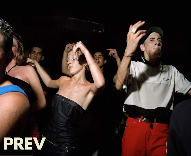
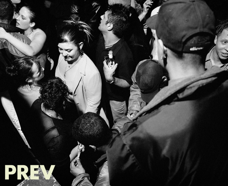
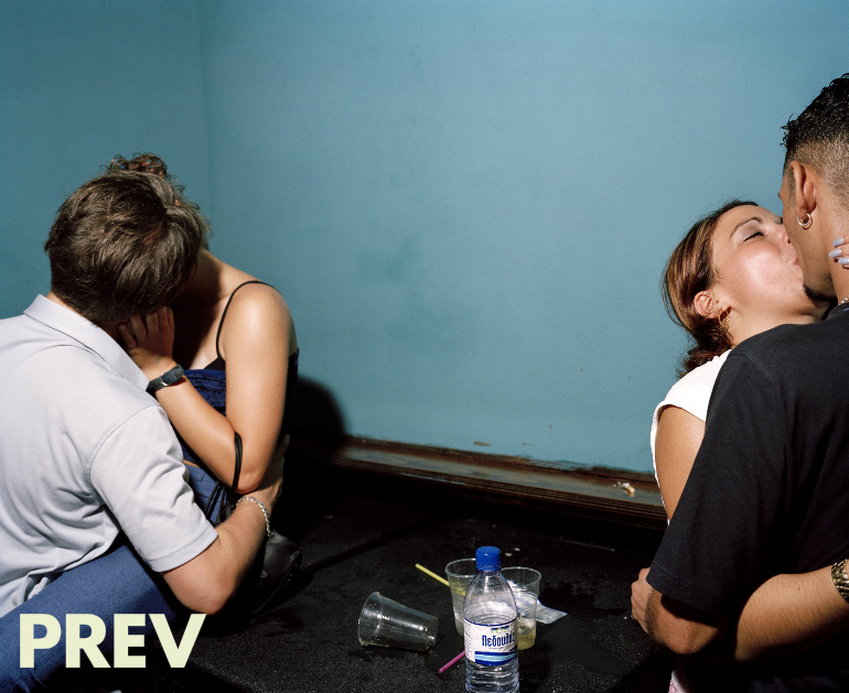
After building up a portfolio for himself after university taking photographs of different grime scenes, in 1999 he worked photographing nightlife, such as the UK garage scene, for fashion and lifestyle magazine Sleazenation. By this time he was going to parties, pub crawls to capture all the action and using 20 rolls of film on average. He got pushed by this company to take more and more pictures with an expected turn out of 100 rolls of film. This gave him the chance to build up an archive of photographs which he explains is valuable within the photography industry. He explained that it gives you the chance to look back at your photographs, with a wide variety of choice to re-publish from.
He believes that taking a gap from education to find your feet and style is a great experience for all students and also a brilliant way to come out of uni, it gives you the freedom to focus on your style and what you want from your career choice allowing you time to develop your ideas.
Ewen Spencer has also worked for other companies such as E4, Puma, Nike, Toyota, Boxfresh, GB Athletes Nike, Last Minute Holidays, T-mobile, Fifa 13, JD, Nokia, and Smirnoff. Between 2001 and 2005 he photographed The White Stripes, an American Rock band. For the NME, he also photographed shows from their first UK tour onwards, including backstage photographs. Obviously whilst pursuing his creative side he has done commercial work to keep his ideas afloat, he has done this by publishing his own photography books. Within 2010 he self-published Three's a Crowd, documenting the early stages of the band's rise to popularity.
After working within the grime scene for a while he began to gain interest into Italy of which he travelled there to complete a documentary photography series. He worked there for an average of 2 years establishing a wide range of photographs, this is where you begin to see his style of photography shining through again as he began a project upon 'Naples Youth 2013'. On return back to the UK people turned there nose up to his documentary travel style, this is when he realised that his popularity and name came from his passion for grime scene style of photography.


I particularly like his work for the natural approach, it shows an effortless image, it's real, which to most viewers is more accepted, nothing is too forceful. It's like as if the photographer isn't even there. When looking at his images it is clear that from graduating from Editorial photography he has learnt not to over-edit his images as sometimes less is more. But also due to his documentary style manipulating the image can then be seen as controversial due to the photographer changing it's state and reality.
Also when looking at his work you can see how although he works at a fast pace you can see how he considers framework and space, and angles within his pictures at all times, which is particularly inspiring as it teaches me as a student that all the techniques that we are learning are valuable to us within our future career.
Overall although this is not my style of photography i particularly like his work for the intriguing depth and storyline within them, it makes you as the viewer wanting to see more and having a storyline with it. However Ewen Spencer likes to leave the photographs as they are, leaving the viewer to create their own story up with their imagination to give enlightenment.
Bibliography
http://en.wikipedia.org/wiki/Ewen_Spencer
https://www.wefolk.com/artists/ewen-spencer
After building up a portfolio for himself after university taking photographs of different grime scenes, in 1999 he worked photographing nightlife, such as the UK garage scene, for fashion and lifestyle magazine Sleazenation. By this time he was going to parties, pub crawls to capture all the action and using 20 rolls of film on average. He got pushed by this company to take more and more pictures with an expected turn out of 100 rolls of film. This gave him the chance to build up an archive of photographs which he explains is valuable within the photography industry. He explained that it gives you the chance to look back at your photographs, with a wide variety of choice to re-publish from.
He believes that taking a gap from education to find your feet and style is a great experience for all students and also a brilliant way to come out of uni, it gives you the freedom to focus on your style and what you want from your career choice allowing you time to develop your ideas.
Ewen Spencer has also worked for other companies such as E4, Puma, Nike, Toyota, Boxfresh, GB Athletes Nike, Last Minute Holidays, T-mobile, Fifa 13, JD, Nokia, and Smirnoff. Between 2001 and 2005 he photographed The White Stripes, an American Rock band. For the NME, he also photographed shows from their first UK tour onwards, including backstage photographs. Obviously whilst pursuing his creative side he has done commercial work to keep his ideas afloat, he has done this by publishing his own photography books. Within 2010 he self-published Three's a Crowd, documenting the early stages of the band's rise to popularity.
After working within the grime scene for a while he began to gain interest into Italy of which he travelled there to complete a documentary photography series. He worked there for an average of 2 years establishing a wide range of photographs, this is where you begin to see his style of photography shining through again as he began a project upon 'Naples Youth 2013'. On return back to the UK people turned there nose up to his documentary travel style, this is when he realised that his popularity and name came from his passion for grime scene style of photography.
The context of his photographs are within a documentary but also educational style, it allows viewers to get an incite into the different cultures that we live around and by doing this it allows viewers to have a more accepted approach to gangs and societies within a younger generation.
As a practising photographer nowadays he tends to work on digital due to the expected turn around with companies, and their tight deadlines. However back in the day he shot a lot in film, this gave him the chance to learn about photography in a more advanced way, but also taught him naturally from trial and error.
His work whilst using film had a harsh and exposing look to them due to the contrasting effect that film cameras add and the natural warming filters. However to produce this he also used a flashgun, by doing this it allows the viewer to see all the detail of the scene clearly without any grain or camera shake due to the bright light and shorter exposure time.
I particularly like his work for the natural approach, it shows an effortless image, it's real, which to most viewers is more accepted, nothing is too forceful. It's like as if the photographer isn't even there. When looking at his images it is clear that from graduating from Editorial photography he has learnt not to over-edit his images as sometimes less is more. But also due to his documentary style manipulating the image can then be seen as controversial due to the photographer changing it's state and reality.
Also when looking at his work you can see how although he works at a fast pace you can see how he considers framework and space, and angles within his pictures at all times, which is particularly inspiring as it teaches me as a student that all the techniques that we are learning are valuable to us within our future career.
Overall although this is not my style of photography i particularly like his work for the intriguing depth and storyline within them, it makes you as the viewer wanting to see more and having a storyline with it. However Ewen Spencer likes to leave the photographs as they are, leaving the viewer to create their own story up with their imagination to give enlightenment.
Bibliography
http://en.wikipedia.org/wiki/Ewen_Spencer
https://www.wefolk.com/artists/ewen-spencer
William Eggleston
William Eggleston born in Tennessee in 1939 is a photographer widely known for his colour photography as an accredited artist medium. He got his first camera at the age of 18, whilst practising with black and white film and printing his own work. Initially he had little knowledge of photography but from this he taught himself through practise. He then went on to study Art at various colleges but never graduated.

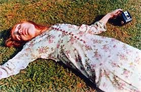
William was particularly influenced by the artist Henri Cartier-Bresson for the simplistic imagery but descriptive through composition. This inspired William to shoot thousands in and around his own town of which he has lived in throughout his entire life, he called his subject banal (plain). The pictures below show his inspiration for photography the 'ordinary' and 'plain', you see similar styles to their work, for example here they both show a relaxed atmosphere, almost worn out but then a difference through it's camera techniques and technology through the use of colour and age of the photographs. However both photos allow you as a viewer to imagine what the person within the photograph is feeling or thinking allowing you to come up with your own interpretation of the meaning and opinion of the photo.

Through the documentary that I had watched about William Eggleston i found out that he finds it hard to answer the question of 'What he photographs?' as there is no other answer than "life today". He believes in taking one picture at one time, this is because it stops you from getting confused over which picture is the most successful. He also leaves his images untitled as he feels like titles take the meaning away from photography. Also, he wants the viewer of the photo to discover their own interpretation of it without being influenced by the title.

William believes in not taking anything for granted in the sense of photographs, every tiny space counts. He treats everything that he witnesses equally symbolizing that all of his pictures of 'nothing' are worth something by declaring it a picture. His most notable work to date would have to be 'The Red Ceiling'. The work he produces is routed from his origins. He explained that he took this image out of the blue whilst talking with friends in bed, he randomly snapped up the image and they carried on talking. The function of all his photos are too evidence life as it is at that time. This is reflected through today's society as a lot of the population takes some form of image everyday using their smart phone or camera, it shows us how imagery has taken over our lives and how evidencing our lives is still used today without us even realising. Of which this image portrays this idea well due to the random composition of such a normal object that we use daily.

The quality of his work shows as he focuses on getting the image correct the first time as i have explained previously, it makes you concentrate on what you want to get out of an image and not what you could possibly achieve, bringing out motivation and thriving you to challenge imagery and art.
He progressed with his skills and love for art by being the first to bring colour into the art world through dye printing, which was used frequently within advertising, commercial and fashion photography. At this point in his life people were shocked and thought his images of colour were awful and did not appreciate them as the colour had showed what viewers already knew of. The function of the photographs were to document 'life' almost like a snapshot of time, representing a memory for somebody. The images work well as William Eggleston has used space within the photographs to balance out the bold colours. The composition of the photos work particularly well within these two images due to the central composition in the first image, the portrait automatically grabs your focus and the leading lines guide you across the image. Within the second image of the red car, the composition is at a diagonal to the puddle of water almost making a frame of which your direction of focus is guided to. His work also stands out for the interesting angles within both of these pictures, one being high, the other low, his innovative style means he stands out against other artists.


Whereas now colour is such a big part of photography and commercial advertising it comes naturally, you will see this though my own pictorial response as the colours within today's society are so vibrant and contrasting. It shows as time went on people have started to accept the impact of colour and how it is not only used in advertising but also day to day life. Therefore linking to the idea of my interpretation of 'life today'.
My Pictorial Response:
Personally I feel like my images do not reflect the style of William Eggleston, this could be because of the different era, time frame and geographical location used. As William lives in America and my images are within the UK, there is a clear difference between the physical appearance making my images associated more with architecture and cityscapes, whereas William has lived in Tennessee in a relaxed and rural location. Similarly fashions and styles have developed over the decades making the images appear different.


Henri Cartier-Bresson
William Eggleston
Through the documentary that I had watched about William Eggleston i found out that he finds it hard to answer the question of 'What he photographs?' as there is no other answer than "life today". He believes in taking one picture at one time, this is because it stops you from getting confused over which picture is the most successful. He also leaves his images untitled as he feels like titles take the meaning away from photography. Also, he wants the viewer of the photo to discover their own interpretation of it without being influenced by the title.
Untitled by William Eggleston
William believes in not taking anything for granted in the sense of photographs, every tiny space counts. He treats everything that he witnesses equally symbolizing that all of his pictures of 'nothing' are worth something by declaring it a picture. His most notable work to date would have to be 'The Red Ceiling'. The work he produces is routed from his origins. He explained that he took this image out of the blue whilst talking with friends in bed, he randomly snapped up the image and they carried on talking. The function of all his photos are too evidence life as it is at that time. This is reflected through today's society as a lot of the population takes some form of image everyday using their smart phone or camera, it shows us how imagery has taken over our lives and how evidencing our lives is still used today without us even realising. Of which this image portrays this idea well due to the random composition of such a normal object that we use daily.
The quality of his work shows as he focuses on getting the image correct the first time as i have explained previously, it makes you concentrate on what you want to get out of an image and not what you could possibly achieve, bringing out motivation and thriving you to challenge imagery and art.
He progressed with his skills and love for art by being the first to bring colour into the art world through dye printing, which was used frequently within advertising, commercial and fashion photography. At this point in his life people were shocked and thought his images of colour were awful and did not appreciate them as the colour had showed what viewers already knew of. The function of the photographs were to document 'life' almost like a snapshot of time, representing a memory for somebody. The images work well as William Eggleston has used space within the photographs to balance out the bold colours. The composition of the photos work particularly well within these two images due to the central composition in the first image, the portrait automatically grabs your focus and the leading lines guide you across the image. Within the second image of the red car, the composition is at a diagonal to the puddle of water almost making a frame of which your direction of focus is guided to. His work also stands out for the interesting angles within both of these pictures, one being high, the other low, his innovative style means he stands out against other artists.
William Eggleston - unseen Kodachrome dye
transfer process photos.
These have been printed from the same group of 5,000 Kodachrome slides from which
Eggleston’s first exhibition in 1976 at the Museum of Modern Art were
taken and have been produced using dye transfer.
Whereas now colour is such a big part of photography and commercial advertising it comes naturally, you will see this though my own pictorial response as the colours within today's society are so vibrant and contrasting. It shows as time went on people have started to accept the impact of colour and how it is not only used in advertising but also day to day life. Therefore linking to the idea of my interpretation of 'life today'.
My Pictorial Response:
Personally I feel like my images do not reflect the style of William Eggleston, this could be because of the different era, time frame and geographical location used. As William lives in America and my images are within the UK, there is a clear difference between the physical appearance making my images associated more with architecture and cityscapes, whereas William has lived in Tennessee in a relaxed and rural location. Similarly fashions and styles have developed over the decades making the images appear different.
Bibliography
DVD: 'The Colourful Mr Eggleston' - https://www.youtube.com/watch?v=3jZ_HkaTXh8
http://www.telegraph.co.uk/culture/film/3647871/A-very-singular-vision.html
Subscribe to:
Comments (Atom)